
For a franchise as adaptable as Assassin’s Creed, it’s admirable how even the series logo continues to iterate and change over time. Each game in the franchise has its own time period, and thus, adapts and changes the symbol of the Assassins to match whatever setting or point in history is being represented. Whether it’s been the 12th century Holy Land or 8th century Scandinavia, practically every new location in Assassin’s Creed has provided fans with a new iteration on that same triangular symbol that’s been prevalent since 2007.
With each changing of the Assassins’ sigil, there’s generally been a thematic undertone representative of that specific entry in the series. That thematic design can be as simple as Assassin’s Creed Syndicate, where the logo features nuts and bolts and rigid edges to symbolize the industrial revolution. At the same time, Assassin’s Creed Rogue utilizes a shattered sigil design to represent Shay Cormac’s betrayal of the brotherhood. Either way, each time an Assassin’s Creed game comes out, that now-iconic video game logo continues to ebb and flow with each changing of the time period and setting.
While the original sigil is still very prevalent throughout the first Assassin’s Creed game, this particular symbol is the Masyaf guild’s sigil from the 11th century Holy Land. Officially known as the “Levantine Brotherhood of Assassins,” this was where it all began for Altair and the franchise itself. First under Al Mualim, and then headed up by Altair after his treachery was discovered, the Masyaf Guild kicked off a globalization effort to branch out the Assassins across the world.
From Assassin’s Creed 2 and Assassin’s Creed Brotherhood, the game’s generally utilized the standard sigil as the main symbol for the game. It is worth noting that Ezio’s Assassin garments and armor had Renaissance-stylized versions of the Assassins’ Sigil, but any kind of guild symbols utilized the standard sigil. The reasoning why the sigil remained standard instead of a stylized version (like the rest of this list) is up for interpretation. Through Ezio’s wisdom, it may have been a desire to remain humble, much like his character arc in Assassin’s Creed 2. It’s a simple but imposing sigil that, perhaps from Ezio’s perspective, didn’t need the extra flair or imagery.
In Assassin’s Creed Revelations, the Turkish guild of the Assassins had a much more stylized version of the Assassins’ sigil. Contrary to the previous sigil, Assassin’s Creed Revelations‘ symbol was chosen to represent Constantinople’s guild by Yusuf Tazim, leader of the Ottoman Brotherhood of Assassins. Ezio, who originally intended to visit Constantinople for a short period, ended up working with Tazim to help rebuild the brotherhood in the city. This particular design takes after early 16th century Ottoman art, which explains the floral and feathery textures around the sigil.
Assassin’s Creed 3‘s sigil is a bit more on the nose with the game’s American Revolution setting. Again the standard sigil returns with minimal additional flair, as this particular version served more as a logo for the game itself, rather than being contextualized in the game events. Connor’s journey in Assassin’s Creed 3 is a lonesome one, as there was no official widespread chapter/guild of Assassins in 18th century America. Taking on the burden of the Assassins’ goals largely by himself, Connor makes a formative impact on the American Revolution as best he can.
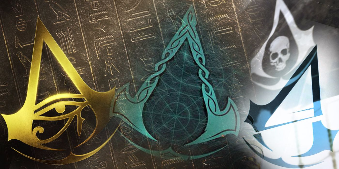
Speaking of “on the nose,” Assassin’s Creed 4 Black Flag‘s sigil is just as obvious for the pirate theme. While this time the sigil was actually prominently featured as Edward Kenway’s ship flag, it strongly stood for the Caribbean pirate theme from the 18th century. It’s arguable that Kenway’s skull sigil is a metaphor for the death of the pirate, which does match up with many events from the game, but the thematic elements of the skull logo are still largely up to interpretation.
This particular sigil was where Assassin’s Creed‘s logos started to become a bit more abstract and interesting, at least from a design perspective. For Assassin’s Creed Rogue, the Assassins’ sigil has a shattered-glass style design that’s a bit more abstract compared to previous efforts. The shattering effect is an effort in symbolism, as it’s representative of Shay Cormac’s betrayal of the Assassin brotherhood. Shay betrayed the American brotherhood of Assassins after a severe difference in morality, and severely halted an Assassins-led search effort to find more Pieces of Eden.
After Rogue, Assassin’s Creed Unity continues the trend of symbolism in its spliced sigil. This particular symbol is representative of the swipe of a guillotine, which makes sense considering the game’s set during the French Revolution at the end of the 18th century. Though it’s not as abstract as Rogue‘s sigil, this particular symbol is arguably one of the nicest designs for the Assassins’ sigil yet. This particular design kicked off Ubisoft’s trend of designing a new logo/sigil that was unique to each time period.
Even though these three games are spin-offs, all three games did end up having one unified symbol for them. Assassin’s Creed Chronicles‘ sigil features what looks like a compass-style star, and even though it’s arguably representative of Chronicles: Russia, this particular logo was used for all of them. There’s really not much more to the symbolism of the star other than it resembles a compass, theoretically referencing the fact that each game took place in a new setting.
Following in the footsteps of Unity, Assassin’s Creed Syndicate‘s sigil represents the British Brotherhood of Assassins. Along with the stylized sharp edges and angles, this particular sigil had various nuts and bolts included to symbolize Syndicate‘s time period: the UK’s industrial revolution.
Bringing Assassin’s Creed into a completely new gameplay direction, Assassin’s Creed Origins rewound the time period clock all the way back to B.C. Taking place in Ancient Egypt, Assassin’s Creed Origins once again eschews any element of subtlety by injecting the Eye of Horus directly into the Assassins’ Sigil. This particular game marked the formation of the “Hidden Ones,” who acted as the precursor organization that would later adopt the name of the Assassins, which is why the game’s symbol isn’t representative of any particular guild or chapter of the brotherhood.
Perhaps the biggest shift for the Assassin’s Creed symbol yet, Assassin’s Creed Odyssey remixed the standard design entirely. While the overall shape is the same, the arches resembled Greek architecture/pillars, and the Spartan helmet was an obvious nod to the time period in the middle. That helmet could also represent the Wolf’s Helm, the helmet of Spartan polemarch Nikolaos, who also happened to be the player character’s adopted father (which is canonically Kassandra, but can also be Alexios as well).
While the game isn’t officially out yet, it’s clear Assassin’s Creed Valhalla‘s sigil is representative of the time period and the player’s perspective. With the game taking place during the Viking Age, the flared sides represent Viking axes, and the handles of those axes have interweaving lines that are representative of Norse fantasy art. Eivor does indeed dual-wield hand axes for one of their weapons, so the sigil could also be representative of the player’s weapons.
Every Assassin’s Creed game continues to iterate on the series’ classic sigil, and while some designs have been a bit more obvious than the last, the most recent designs show that every new sigil will have a clear stylistic and thematic inspiration.
Assassin’s Creed Valhalla releases on November 10, 2020, for PC, PS4, Stadia, Xbox One, and Xbox Series X/S. The PS5 version releases on November 12, 2020.
![]()
www.itsec.hk
www.itsec.vip
www.itseceu.uk
Leave a Reply