
Paramount has released a teaser for its upcoming Clifford the Big Red Dog Movie, and despite it only being 19 seconds long, it still managed to become something of a controversy, with complaints about how Clifford looks. Comparisons have ever been made to the first design Sonic received for his first live action movie. The live action version of Clifford has also be unfavourably compared to the upcoming live action Tom and Jerry movie, which opted to keep its title characters 2D. That’s unfair; none of the reasons why Sonic benefitted from a redesign apply to Clifford’s live action debut, and his design is actually quite good.
It’s easy to forget the people whose work go into making the movies we love, especially for stuff like animation, where audiences don’t see them, only the finished result they put out. In the case of Sonic the Hedgehog, redesigning the character took many hours, a lot of money, and the studio closed not long after. With all the inherent risk involved in something like “completely change how the main character looks” the cost does have to be factored in, and the question does have to be asked “does this movie need it?”
So why have character designs been altered in the past? In live action Sonic’s case it would be easy to just call the whole thing ugly and call it a day, but it’s more than that. Sonic’s original live action design seemed to be an attempt to make a “more realistic” or “natural” version of its source material. Real hedgehogs don’t have big cartoony eyes, so shrink them down a bit, and make them clearly separated. Real hedgehogs don’t wear gloves, so replace them with white fur on his hands instead. It’s a similar problem superhero movies used to have. The people in charge of the movie feel that there is something in the source material they want to move away, so they change it accordingly, and the result looks wrong.
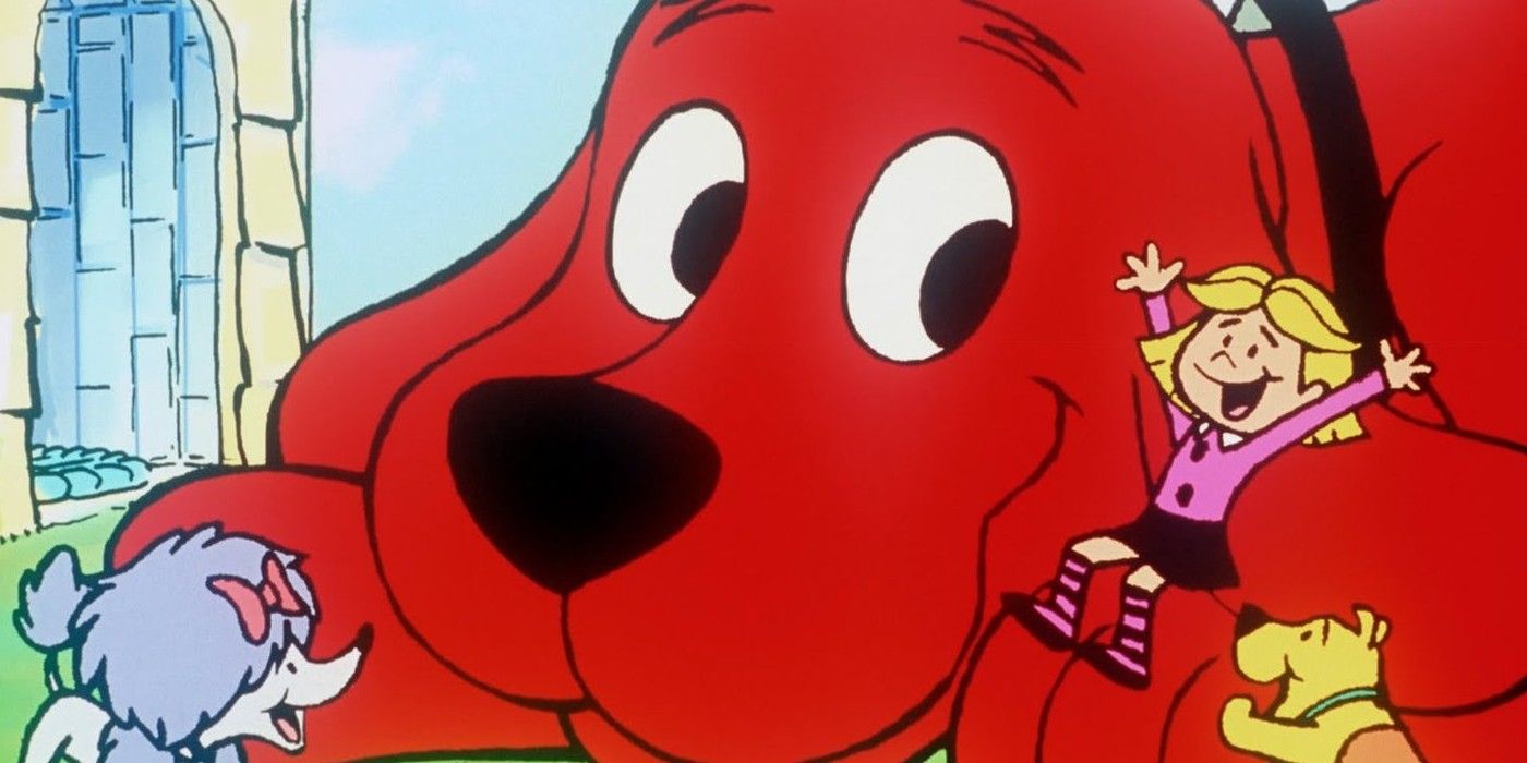
Outside of satire, a dislike for what you are basing your moving on is generally not a good place to start; it leads to movies feeling like they are apologising for something, which is not a good place to start when you are basing your moving on a family friendly video game or children’s show. Clifford’s design does not have this problem. The character is a big red dog, and that is exactly what his upcoming movie looks set to give us. Unlike Sonic, there is no translation process beyond making him look like a dog, and making him red. If realism is what a film maker is going for, the only real interpretive decision they need to make is what shade of red to make him. Even the comparison to Tom and Jerry isn’t fair. The characters in that franchise are simply animals, like Clifford himself, but they’ve always been at least a bit anthromoprhic. Enough about them has been changed, and their animation styles have been so distinct, that the two would require as much thought to put into live action as Sonic did. Clifford on the other hand is a very simply drawn cartoon dog; there isn’t as much “lost” by just having him look like a regular dog who happens to be red, and rather large.
When the “live action” Lion King movie came out, fan redesigns became popular online; using the original Lion King as a basis, these images were halfway been the more realistic look of the remake and the cartoony style of the original. They were popular because of the remake’s main failing; the characters (especially the lions) looked too stiff. The original movie relied on its characters having very expressive designs, that’s why their eyes were so big. Real lions aren’t expressive in the same way though. This would have been fine if the movie had altered the scenes around its characters expressing themselves in other ways, but they didn’t; hence the fans stepping in with alternatives of their own.
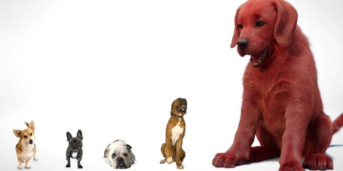
This is also a problem that Clifford doesn’t have. As anyone who has spent much time looking at a dog will be able to tell you, they are very, very expressive, especially breeds like Clifford’s who have floppy ears. Shifts in everything from their ears, to their eyes, to even the position of their heads can show all of a dog’s individual moods and quirks. Clifford was only in his teaser for a matter of seconds, but even that was enough to show what a happy dog he is; giving the audience a big doggy smile, and licking the screen. The animators have even done a fantastic job with Clifford’s eyes. They’ve managed to avoid the long running problem of creating “realistic” eyes which look glassy and lifeless. There is a lot of energy in those eyes alone. When Clifford smiles it’s clearly the happy, natural face of a good boy. Such a good boy, yes he is, yes he is… this article may be getting off track.
It’s too early to make any guess on how good Clifford the Big Red dog. So far all we’ve seen is a teaser, and the main character was barely in it. His design however, is spot on. He looks happy, and full of energy. It’s spot on because the film’s animators have clearly understood that they don’t need to tinker too much with Clifford’s design. The character’s appeal comes from being a dog who happens to be red, and is so big that he gets into comic misadventures that a dog normally wouldn’t, or at least are comically exaggerated versions of a typical dog’s day. There is no need to imagine his design in a new context, or to over think it. This version is exactly what it needs to be, and nothing more. Let’s hope the rest of the movie is just as strong.
![]()
www.itsec.hk
www.itsec.vip
www.itseceu.uk
Leave a Reply