
Slack is getting heat for changes it’s making to the app.
What you need to know
- Slack’s latest updates are making users complain about the changes being made in the app.
- The in-app font has changed and is now larger, while the layout of notifications is also being altered as well.
- Changes to the notifications only apply to users of the beta app for now.
Amid the increase in users working from home, Slack has taken the helm as one of the best messaging apps for workplace communication. But recent changes being made to Slack’s Android app have been causing some disarray among its users. The company recently warned users to change passwords and wipe their data due to a bug that was introduced in a December update. After the bug was fixed, Slack decided that was the perfect time to start making some changes. They may be small, but they’re noticeable enough that users have been complaining.
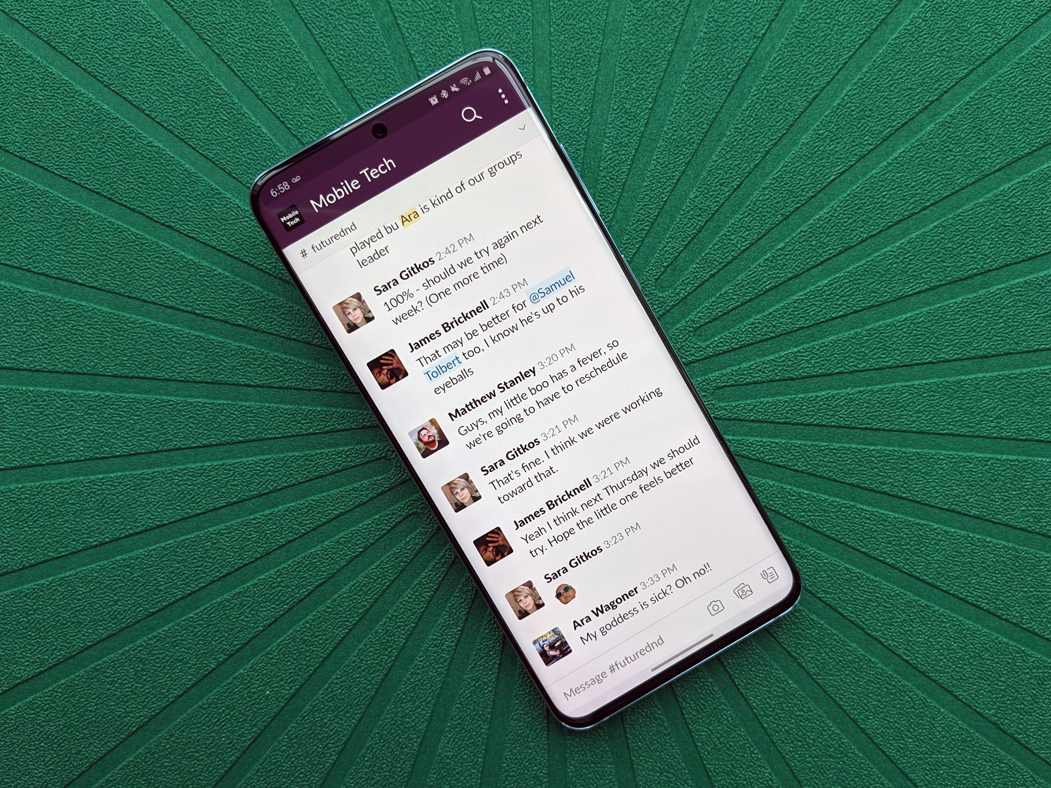
The first has to do with the font, which apparently has increased in size since the recent update. The text spacing has also changed, making things not only less dense but also less uniform than before. For comparison:
You can see in the two screenshots taken from 9to5Google how the change affects the density of messages displayed in a thread, with two messages essentially cut off from the top of the conversation. It may seem like a small change, but the less scrolling users have to do, the better.
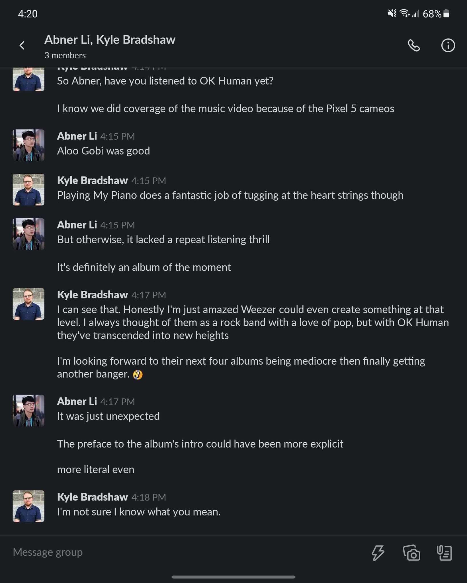
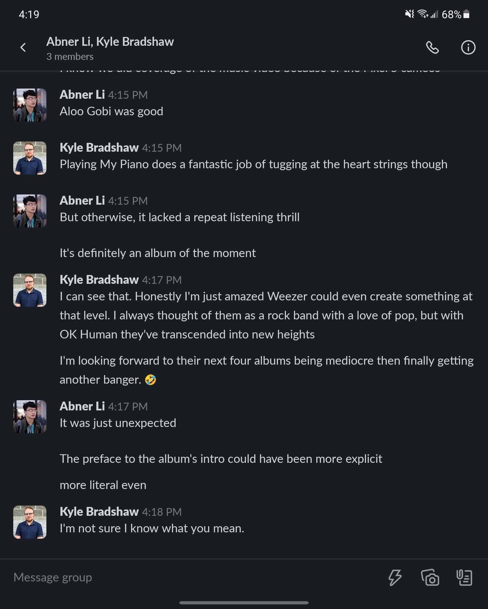
Another change being made is more specific to users on the beta version of Slack, but this change affects notifications. Before the update, the sender’s profile photo would appear to the right of the message, with the message below the room name. The update has altered the layout of notifications:
Now, Slack shows notifications on Android with generic icons for types of rooms off to the left side, grouping profile pictures for DMs, with message content off to the right side with totally different layouts for user’s names and messages too. It’s quite a jarring change.
It’s not clear why Slack has started making these subtle changes. While some may not mind them, Slack has a growing user-base now that more people are working from home. Any change made to the app could be quite noticeable to those who rely on it for workplace communication, especially if it doesn’t necessarily contribute to making the app more productive or user-friendly. Making visual changes just to change them could end up doing more harm than good.
For now, the change to notifications seems to only affect users on the beta app, but it could eventually make a stable release. Meanwhile, Slack recently took to Twitter to respond to criticism around the text font and spacing (which our own Daniel Bader simply calls “awful”), giving a fairly disapointing message:
Hey there, currently there is no option to revert. We are actively listening to the feedback received surrounding this change. We’ll share your thoughts with the rest of the team. ?
— Slack (@SlackHQ) January 28, 2021
![]()
www.itsec.hk
www.itsec.vip
www.itseceu.uk
Leave a Reply