
Minor visual tweaks and under-the-hood improvements.
The first developer preview of Android 12 has arrived, and with it, a myriad of minor visual tweaks and development tools. As is always the case with developer previews, this build is mostly intended to give software developers a base platform on which to prep their apps and services, ensuring a smooth transition when Google eventually rolls out the official public-facing build.
This build isn’t intended for daily use, and you absolutely should not install it on your primary phone, but if you have a spare device sitting around, the good news is that you don’t need one of the best Android phones to run it — this initial developer preview is available for the Pixel 3 series and all subsequent models. With that in mind, I flashed the build onto my Pixel 5 to see how it differs from Android 11.
Under the hood
Especially this early on, most of the changes introduced with Android 12 are happening behind the scenes, and you may never even notice them. Android 12 is introducing a new unified API for receiving content, which will make it easier and more consistent to be able to copy and paste text, images, and videos between apps.
Android 12 is also introducing support for AVIF, a new image format that significantly improves image quality without increasing file sizes, and can automatically transcore HEVC and HDR video files to the more widely compatible AVC format.
Additionally, there are quite a few security-focused and behavioral changes brought on with Android 12 — we’ll be doing a deep dive on those shortly.
Redesigned notification shade
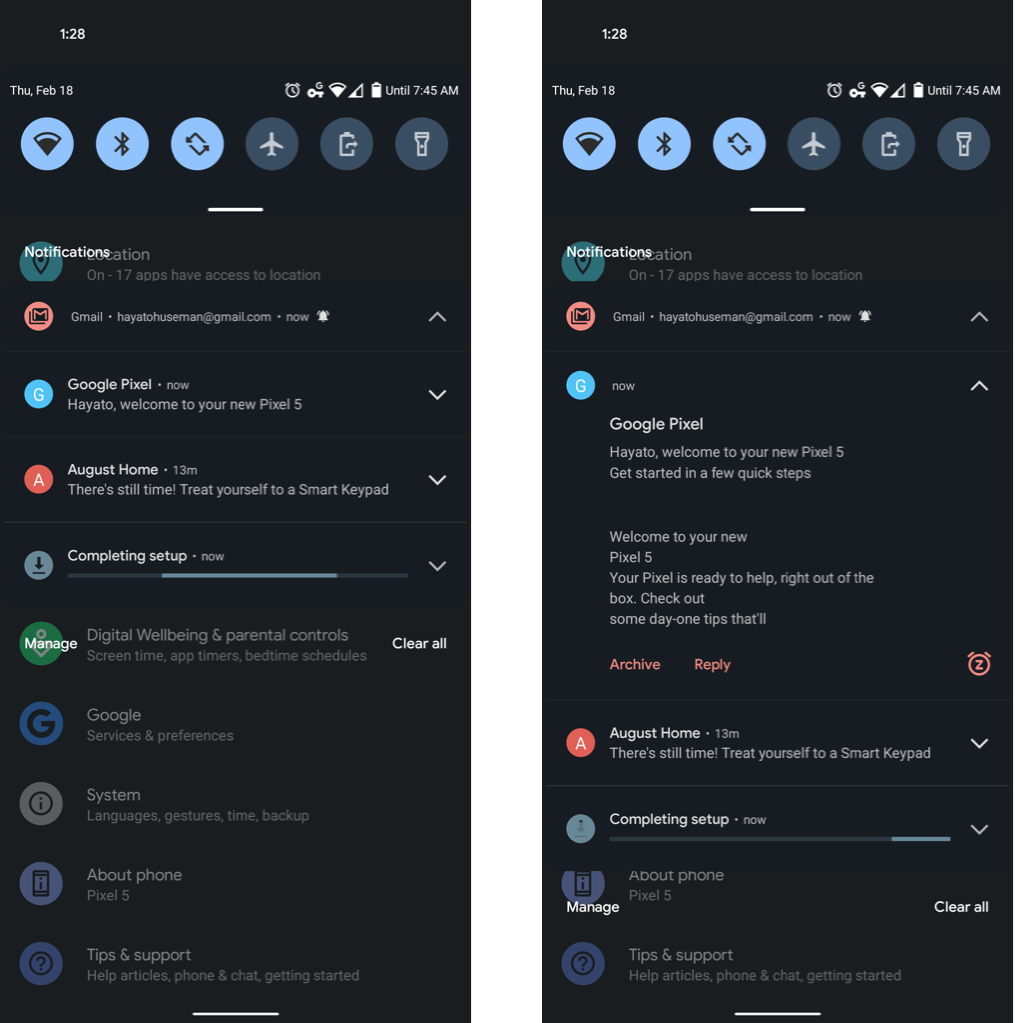
While Android 12’s general UI looks largely unchanged from that of Android 11, one of the most notable differences is the redesigned notification shade. App icons on the left side of incoming notifications are uniformly circular now, and there’s a new dedicated snooze button in the bottom right corner of notifications from apps like Gmail. Considering how inconspicuous the half-swipe action for snoozing notifications was previously, this is a welcome change — though you can still access the snooze menu this way, as well.
The opacity of background elements behind notifications is slightly changed as well, and there’s considerably more spacing between text, making each notification bigger than before. Text is also now indented a bit to the left of the notification icon, as are the actionable buttons beneath the notification text. The whole look is a bit more crowded than before, but it calls more attention to each individual notification.
Screenshot UI
We’re still not seeing native support for scrolling screenshots enabled by default, though XDA Developers editor-in-chief Mishaal Rahman was able to enable the setting in an Android emulator for a (rather buggy and crash-prone) preview of the feature. Otherwise, screenshots look the same as before on my Pixel 5.
Occasionally, the X button in the top-right corner of the screenshot preview disappears, and Android Central’s Alex Dobie notes that it doesn’t appear at all on his Pixel 4a 5G. My best guess is that this suggests the X button is on its way out in future builds; in the mean time, you can either tap on the X button or simply swipe the entire preview away.
4×5 grid on the home screen
The home screen UI looks virtually indistinguishable from before, but within the home screen settings, you can now enable a 4×5 grid in case the default 5×5 is a bit too crowded for your taste. To access this option, simply long-press on a blank spot on the home screen, then tap Styles & Wallpapers and choose the Grid tab.
In previous builds of Android, users were given the choice between the default 5×5 grid, 4×4, 3×3, and 2×2. Personally, I’ve been perfectly happy with the 5×5 grid, but it never hurts to offer more options — though can we please move the grid layout to the general Home settings?
Safety & Emergency
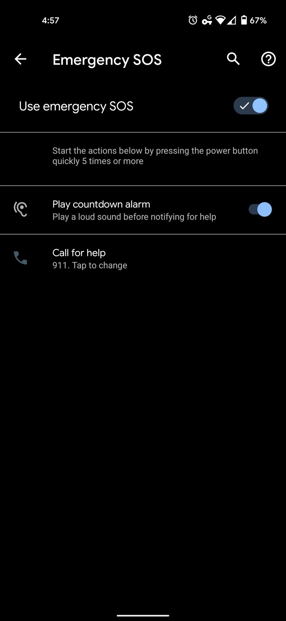
In addition to the Safety app Google has included with the last few builds of Android, Android 12 now features a Safety & Emergency section in the forefront of the Settings app.
While most of the features therewithin are nothing particularly new, this provides quicker access to editing your emergency contact information, as well as enabling car crash detection and crisis alerts.
One noteworthy new feature of the Safety & Emergency section is Emergency SOS, which when enabled will allow users to instantly call 911 (or another number such as an emergency contact or local emergency services, with the caveat that changing the number means your phone will need to be unlocked to use this feature) by pressing the power button five times.
You can also choose whether or not to play a countdown alarm before notifying for help, reducing accidental emergency calls.
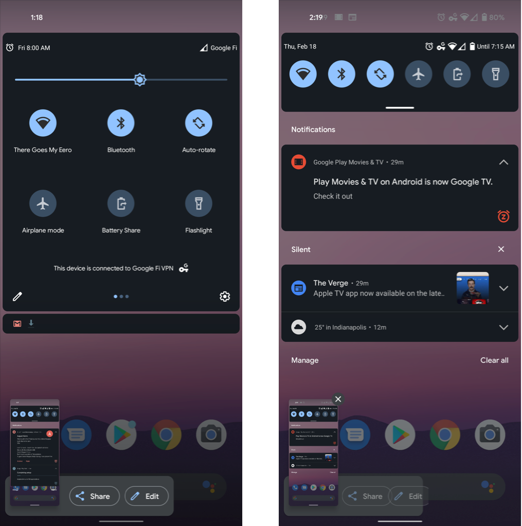
Share Wi-Fi with Nearby Share
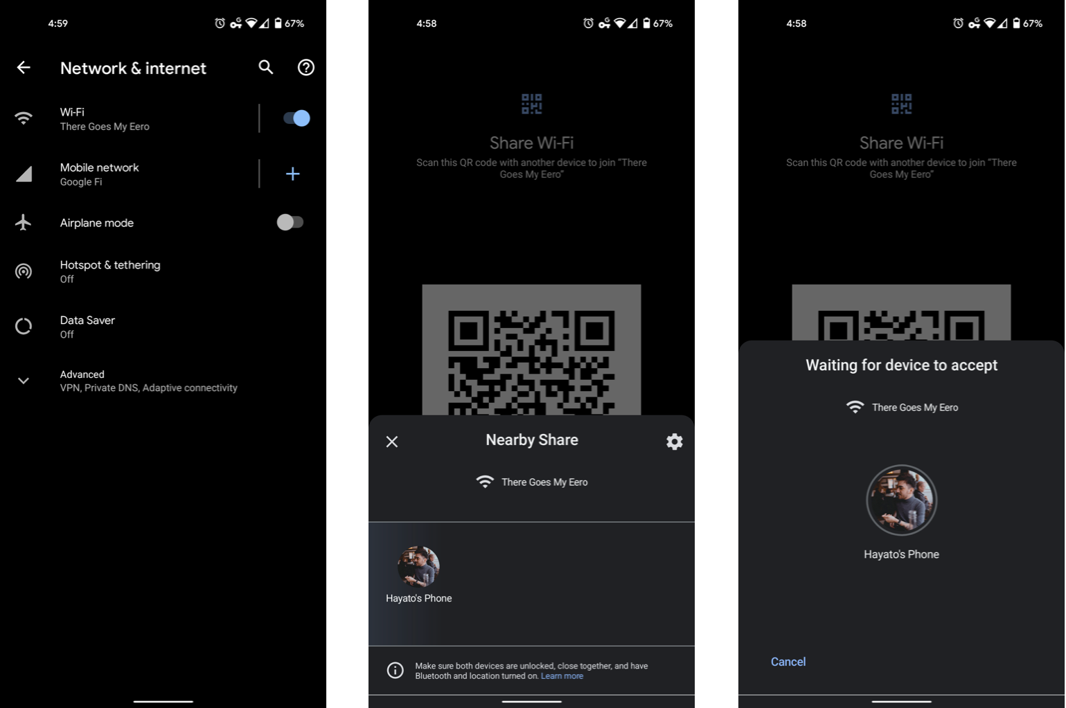
You’ve been able to conveniently share your Wi-Fi network with others for a while now via QR code, accessed by long-pressing the Wi-Fi network in the Network & Internet section of the Settings app and tapping Share, but with Android 12, you can make use of Google’s new Nearby Share feature to bypass the need for even a QR code.
So long as both users have Nearby Share enabled (which only requires that Wi-Fi and Bluetooth be enabled), tapping Nearby Share on a Wi-Fi network in Android 12 will open a small sharing dialogue displaying nearby devices, and tapping a device will prompt the recipient to accept, after which they’ll be connected to the Wi-Fi network automatically without even needing to enter a password.
Markup now supports emoji and text
In addition to the markers, pens, and other various drawing tools previously present in Markup, Android 12 adds support for adding emoji and text to your screenshots. As always, you can access Markup by tapping the Edit button after taking a screenshot.
Just to the right of the crop button in the toolbar, there’s now a text button, followed by a sticker button for adding emoji. Text input is still fairly rudimentary; you can add as many text elements as you’d like, resize the text, or change the color, but there’s no options for adjustable opacity or different fonts.
Tapping the stickers button opens a small toolbar with six emoji, and tapping the three dots next to those options pulls up a more complete list, containing all of the same emoji you’re able to use elsewhere. Just as with the text, you can resize and reposition the emoji. I’d love to see emoji kitchen support make its way here eventually.
Remove apps from the expanded media controls
One of Android 11’s best features was the expanded media control system in the quick settings shade, consolidating all of your active media into one place. But as we’ve spent more time with this feature over the last year, it’s become apparent how annoying it can be when it aggressively inserts media controls from an app you don’t want to use.
With Android 12, you can now selectively prevent apps from appearing in the expanded media controls. To do this, go to Settings>Sound & vibration>Media, then toggle any unwanted apps off — I’m looking at you, YouTube.
Find A Teacher Form:
https://docs.google.com/forms/d/1vREBnX5n262umf4wU5U2pyTwvk9O-JrAgblA-wH9GFQ/viewform?edit_requested=true#responses
Email:
public1989two@gmail.com
www.itsec.hk
www.itsec.vip
www.itseceu.uk
Leave a Reply