
All Pokémon players are familiar with the concept of “shinies”: rare Pokémon variations bearing an alternate color scheme. Since they’re incredibly scarce, they serve as a badge of honor for dedicated Trainers, a testament to the hours of searching required to find one. Though they don’t have any special powers, players love shinies for their rarity and unique style.
However, not all shiny recolors are done well. It’s bad enough when they barely look different from their original versions, but some are garish or just plain bizarre, detracting from their appeal. Here are a few beloved Pokémon whose shiny variants ruin their excellent designs.
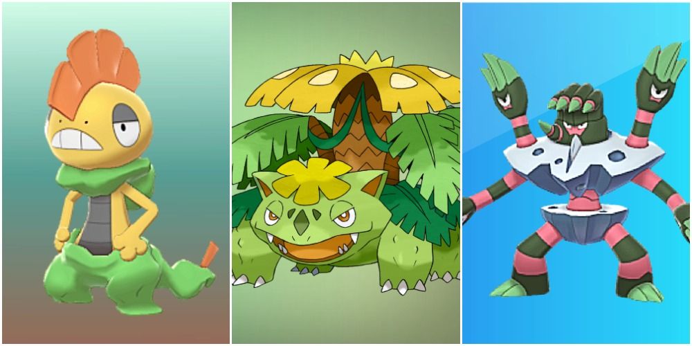
10 Venusaur
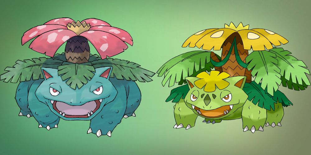
While it’s not the worst of the worst, Venusaur’s shiny variation is deeply disappointing. While the regular form is beautifully vibrant, shiny Venusaur looks sickly. The yellowed green of its body and leaves, coupled with the sickly yellow of its floral elements, makes it look like it’s wilting.
A better recolor for Venusaur could have been to change the body to a dark green or dark blue, and the flower deep purple. This would have retained the lush tropical vibe, as well as hinting at Venusaur’s Poison typing.
9 Noivern
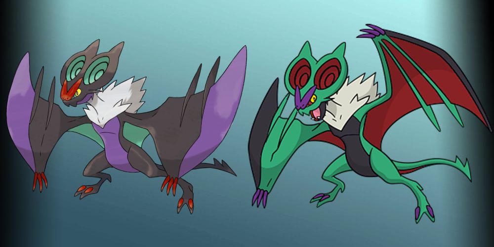
A few shiny variants use this tactic, taking the same colors from the regular sprite and swapping around where they’re used in the design. Unfortunately for Noivern, this technique resulted in a letdown of a shiny sprite.
This Gen VI Pokémon’s original design is bold without being gaudy; the bright accent colors don’t overpower it. On the other hand, the shiny version puts the red and turquoise front and center. The colors no longer complement each other; rather, they clash in an unattractive way.
8 Ursaring

“Sickly green” appears to be a running theme with poorly designed shiny Pokémon. Ursaring’s shiny form is a harsh, loud radioactive shade, transforming this magnificent bear into an eyesore.
A green shiny form isn’t necessarily a bad choice for Ursaring, but it’s been executed poorly. A dark pine green, perhaps with dark gold accents, would have suited this forest-dwelling Pokémon perfectly. Another great choice could have been to turn this woodland brown bear into another species, like a polar or black bear.
7 Lucario
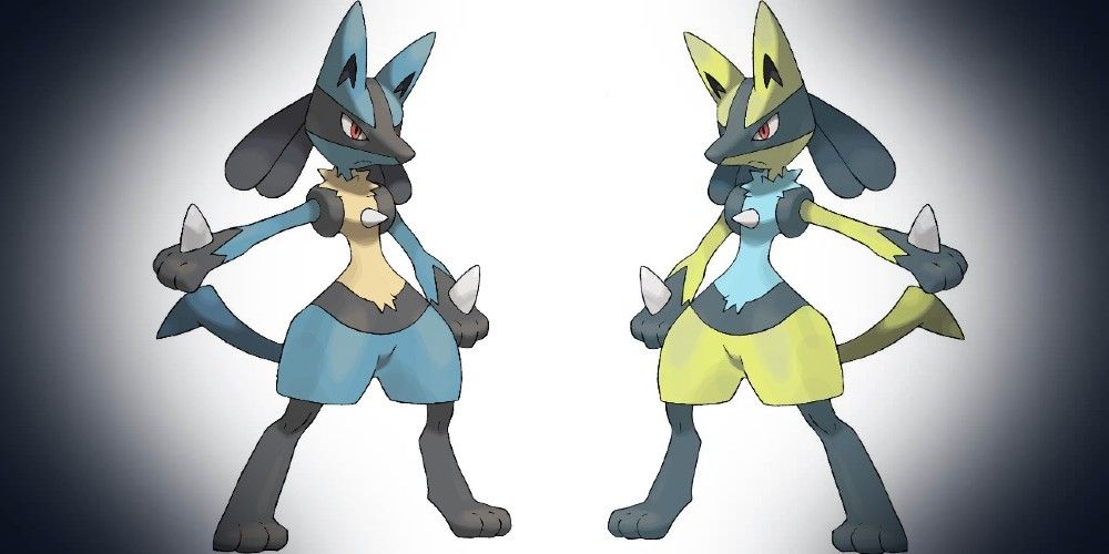
Lucario is a fan favorite, and for good reason: It’s powerful, fast, and beautifully designed. Unfortunately, with the alternate color palette, its grace and poise don’t translate to its shiny form. Bright colors don’t fit with this Pokémon’s poised, stoic nature—and these particular shades aren’t visually appealing either.
As with Noivern, swapping the main and accent colors didn’t work out for Lucario. This regal-looking Pokémon’s shiny form is garish and loud, with an icky yellow-green as the dominant color.
6 Ferrothorn
Ferrothorn’s shiny variant doesn’t really make sense. In its regular form, the silver colors reflect its Steel typing, while the greenery represents its Grass-type parts. The shiny version turns these to khaki yellow and dull red.
Furthermore, these colors are, again, just not good to look at. An inverted color scheme, as was done with Lucario and Noivern, actually would have worked very well for shiny Ferrothorn. Sadly, players are currently stuck with an ugly, insipid shiny for this powerful Pokémon.
5 Scrafty

Too many bright colors in high volume usually tend to clash, and shiny Scrafty is no exception. This Pokémon’s original form features warm colors that coordinate well, and also evoke the feeling of its desert habitat. Its shiny variant, however, is painted orange, bright yellow, and neon green.
Shiny Scrafty no longer looks tough or intimidating, the whole conceit of its personality. It looks less like a fighter, and more like a clownish caricature—not something a Fighting-type Trainer would be proud to have on their team.
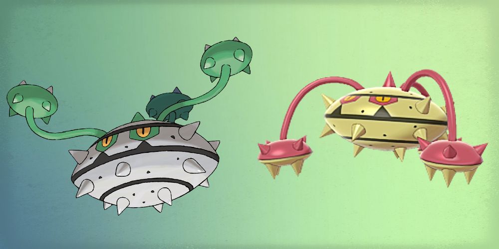
4 Barbaracle
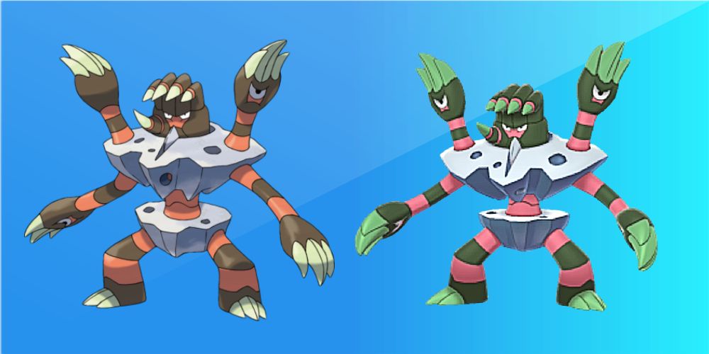
Barbaracle’s design isn’t exactly subtle, to begin with, what with its stripes and spikes. The shiny version, though, takes it to another level. It looks like something out of Dr. Seuss—and not in a good way. The pink-and-green stripes are bright and lurid, and really don’t make sense with its typing.
Blue shades could have worked well for shiny Barbaracle, perhaps paired with gray or black. The shades of its current shiny variant, though, are more reminiscent of a badly designed floral Pokémon.
3 Mismagius
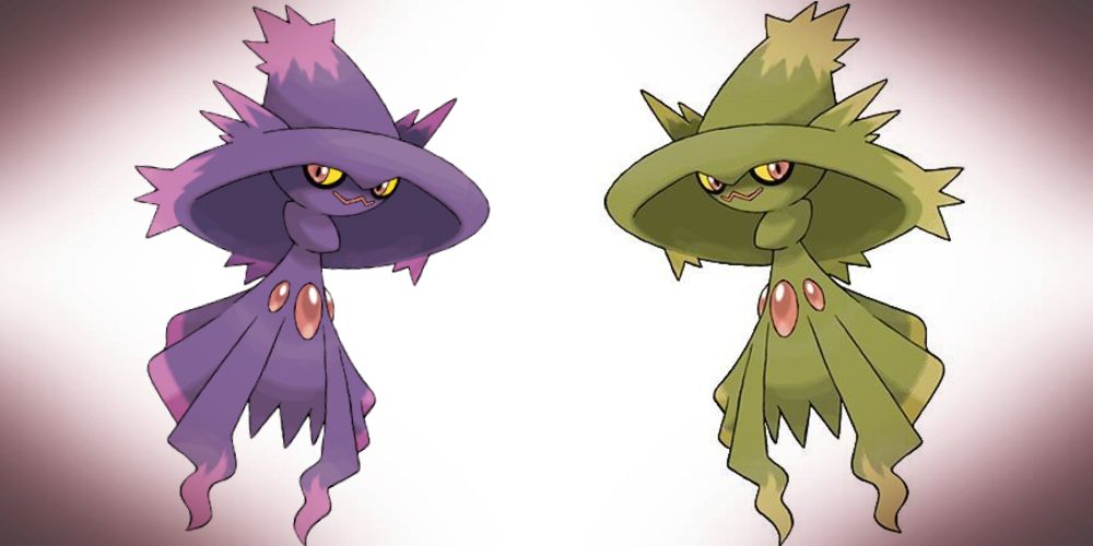
Mismagius is another unfortunate sufferer of the brownish-greenish-yellow curse. In its normal form, this Gen IV Pokémon exemplifies Ghost-type design. Its shape, color, and smirk evoke the spooks and mischief that characterize its personality. The shiny recolor just looks sort of gross, and doesn’t work thematically at all.
A yellow Mismagius isn’t necessarily a terrible idea. A very pale, harvest-moon color could have worked quite well for this nocturnal Pokémon. However, as it currently stands, the original form is far more appealing.
2 Buzzwole
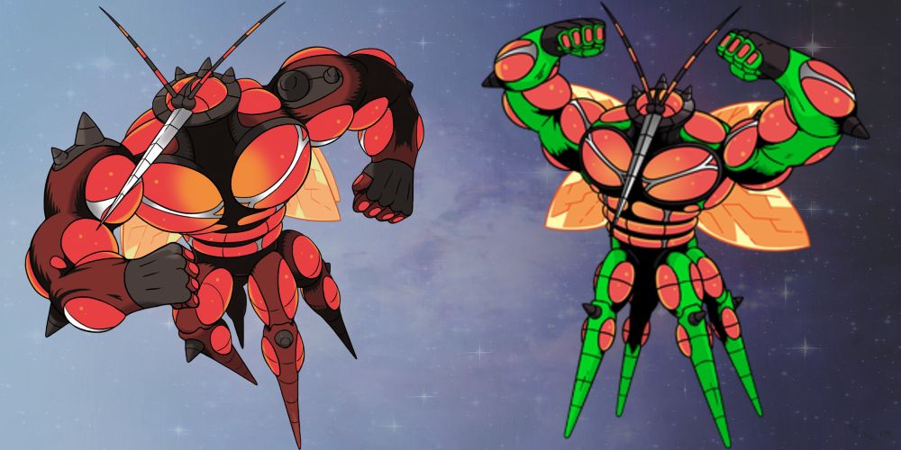
In its shiny form, this mighty Ultra Beast becomes an eyesore. The curse of neon green has blighted many a shiny Pokémon, but for Buzzwole, it’s made even worse by clashing with the vermillion of its muscles.
A better choice would have been to avoid violently colored accents and change the entire color scheme. Blue, purple, green in its entirety—any hue would be better than this bizarre choice. Buzzwole’s monochromatic scheme is part of its visual appeal, as the colors don’t distract from its powerful silhouette.
1 Kommo-o
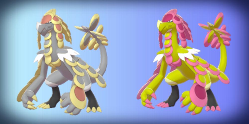
Majestic Kommo-o’s shiny form is, to put it bluntly, absolutely hideous. Yet again, sickly greenish-yellow dominates the color scheme, and clashes horrifically with the hot pink accents. While the original is imposing and regal, the shiny variant looks like something out of a circus.
Kommo-o’s scales have been used to make armor for ancient warriors in the Pokémon world, but it’s hard to imagine a noble knight clad in these shades. A dark-colored shiny with silver accents would have suited this Pokémon far better.
Find A Teacher Form:
https://docs.google.com/forms/d/1vREBnX5n262umf4wU5U2pyTwvk9O-JrAgblA-wH9GFQ/viewform?edit_requested=true#responses
Email:
public1989two@gmail.com
www.itsec.hk
www.itsec.vip
www.itseceu.uk
Leave a Reply